When your flow
goes rogue
Packaging Design | Branding
Print
2023
Mentor
Jennifer Cole Phillips
Designer
Jia Yu
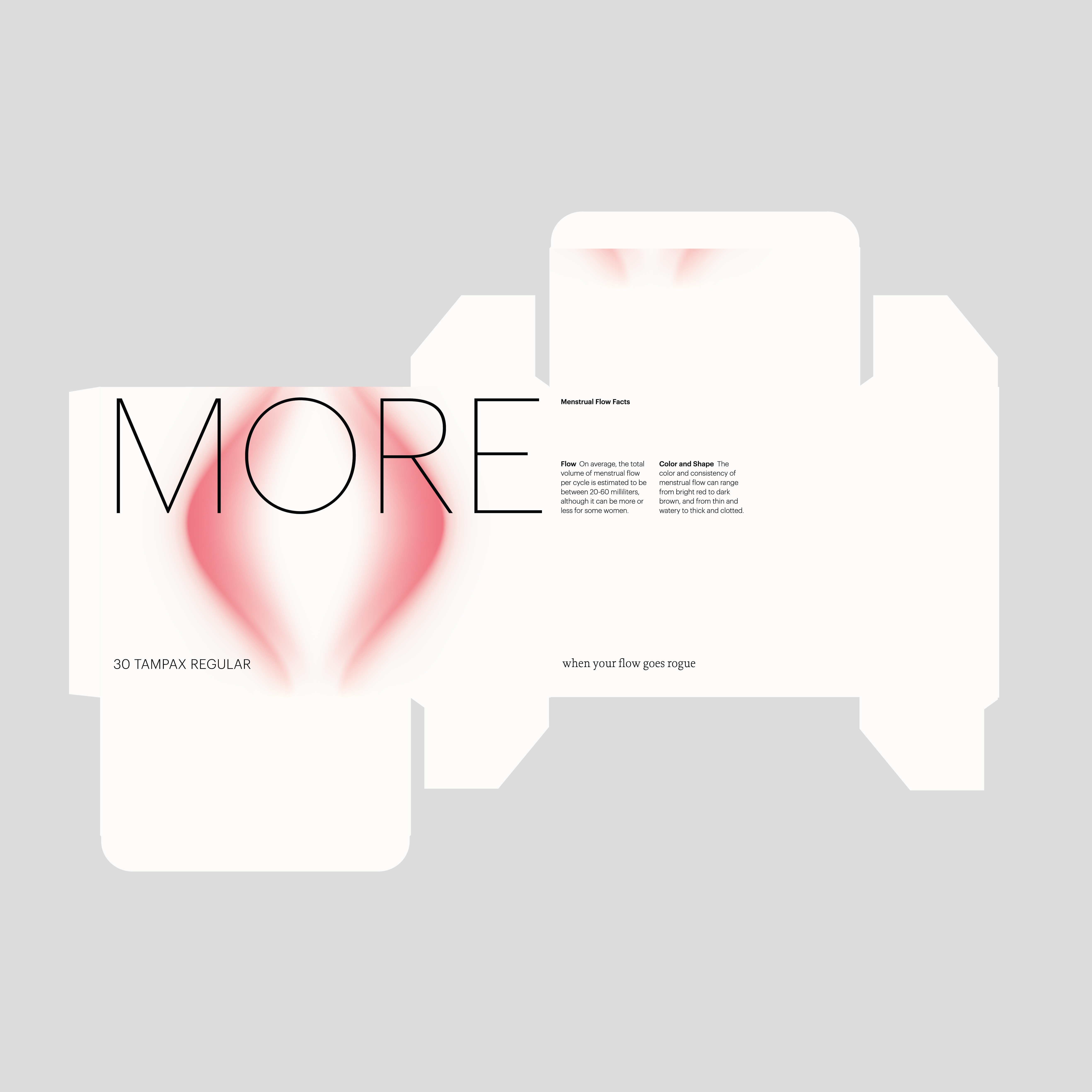
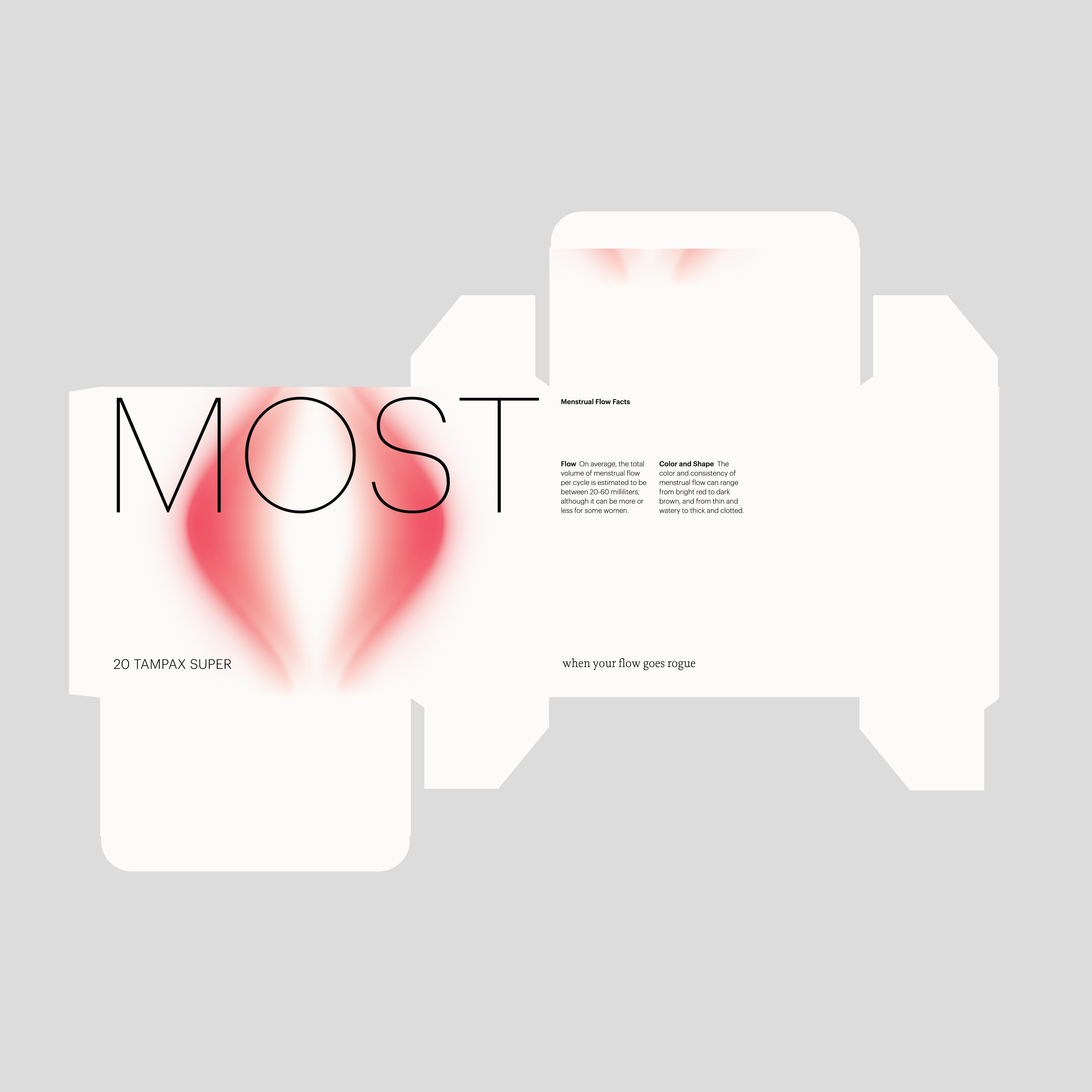
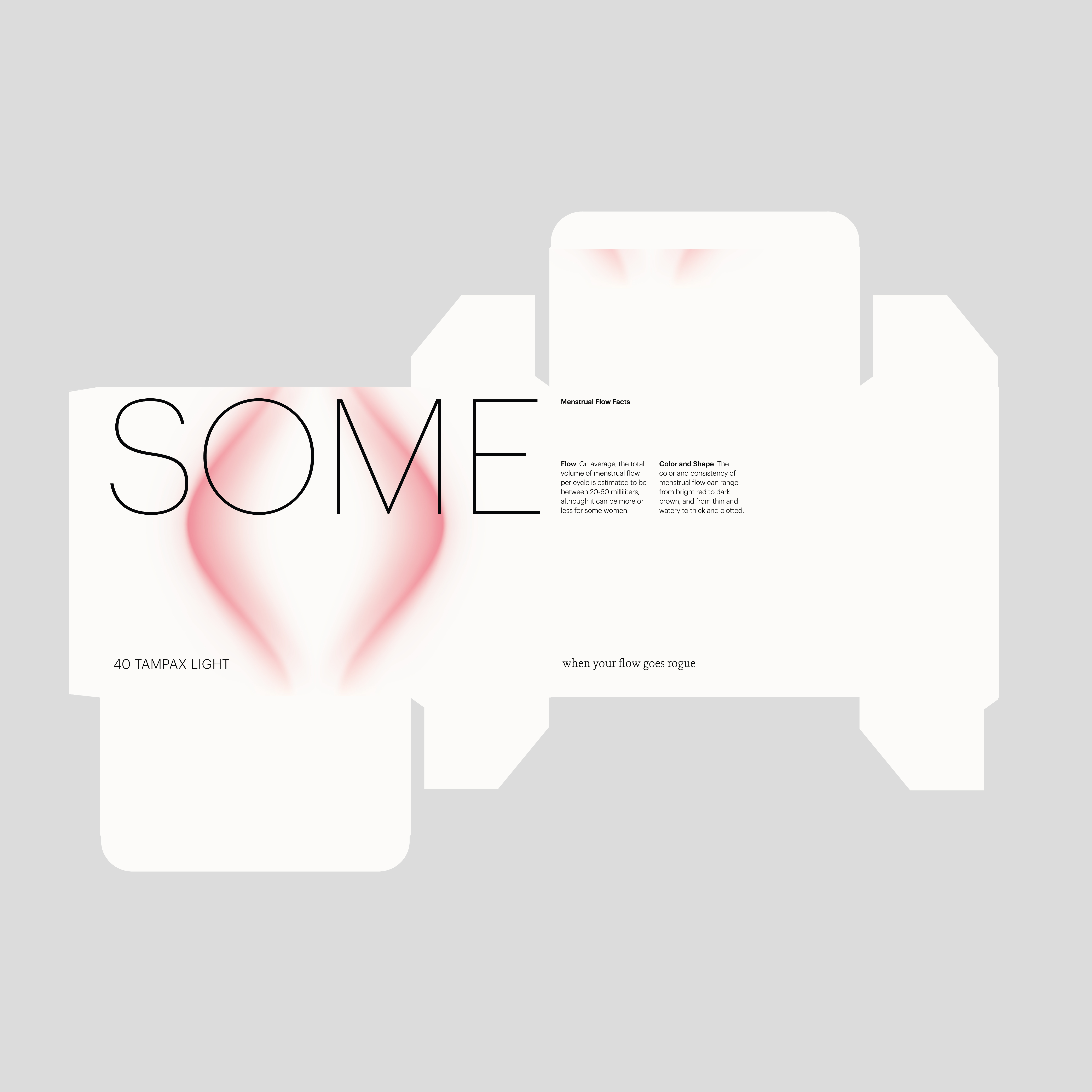
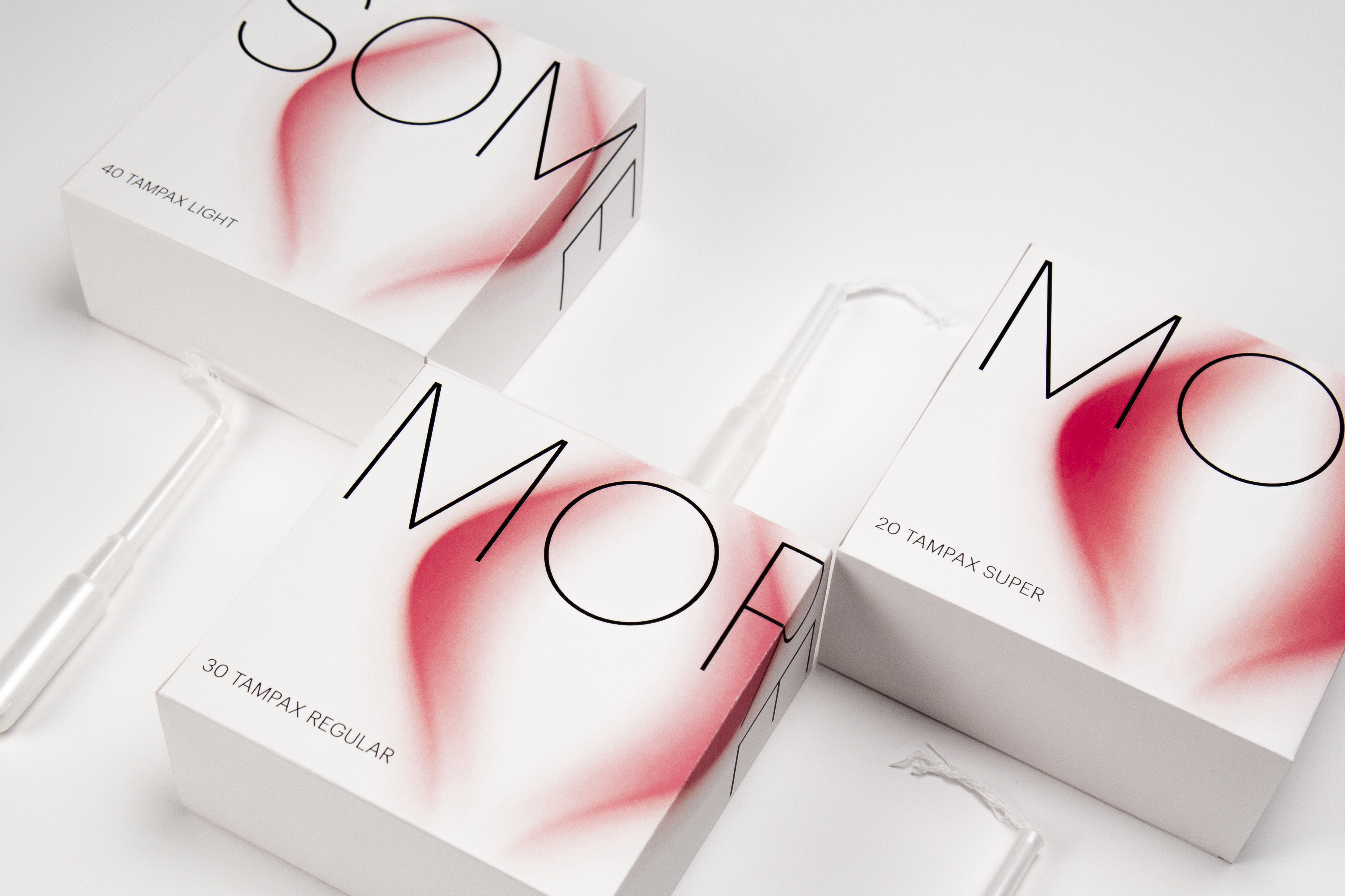
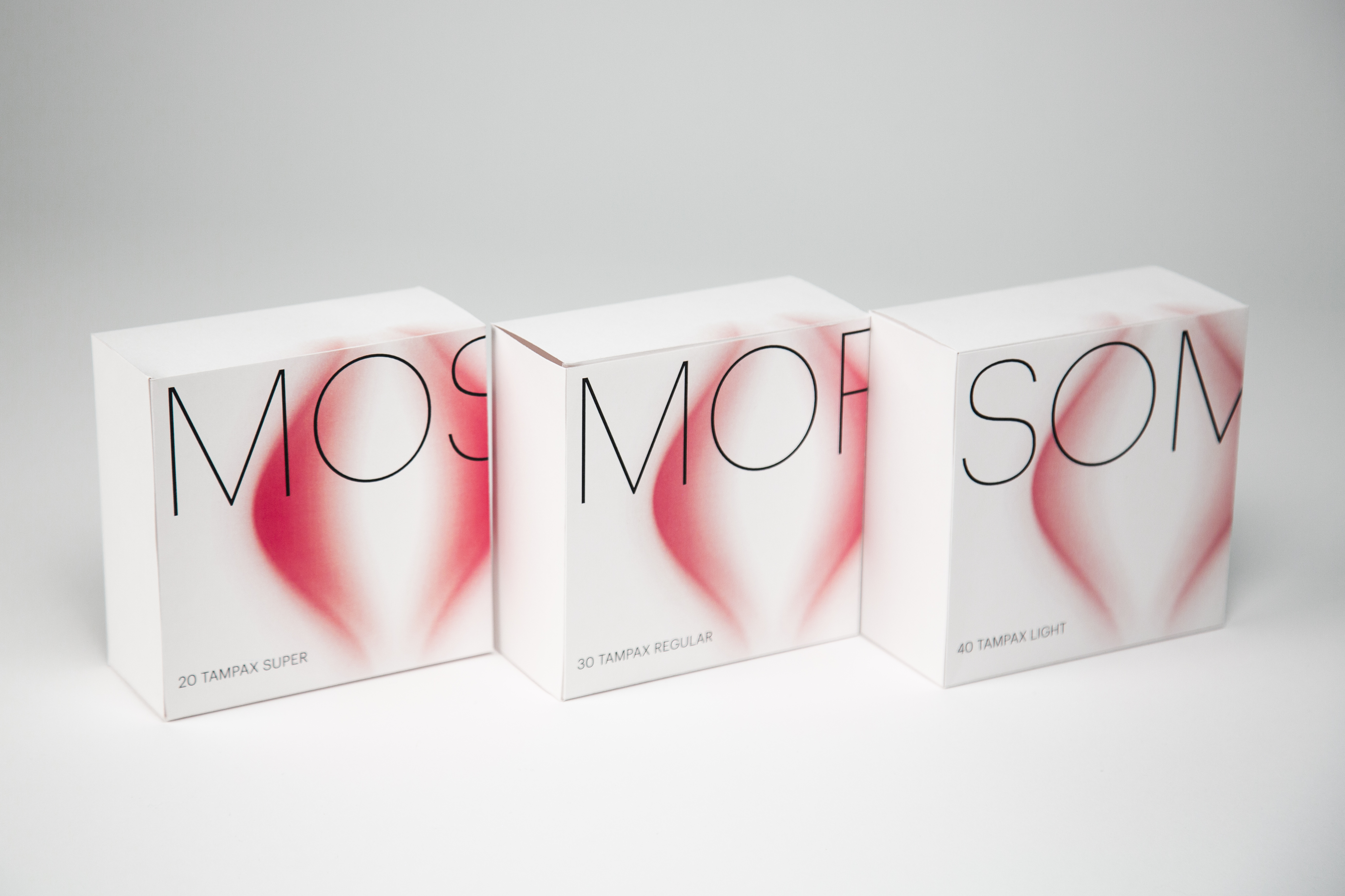
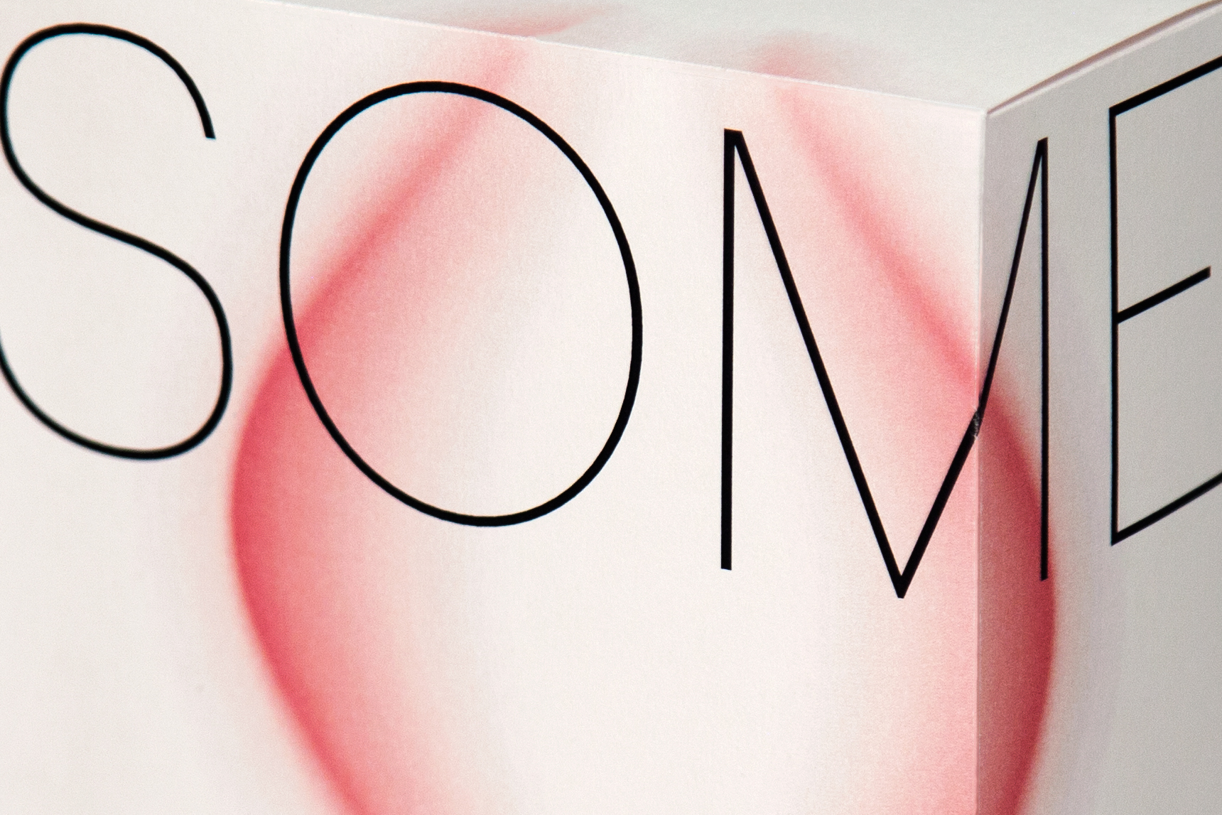
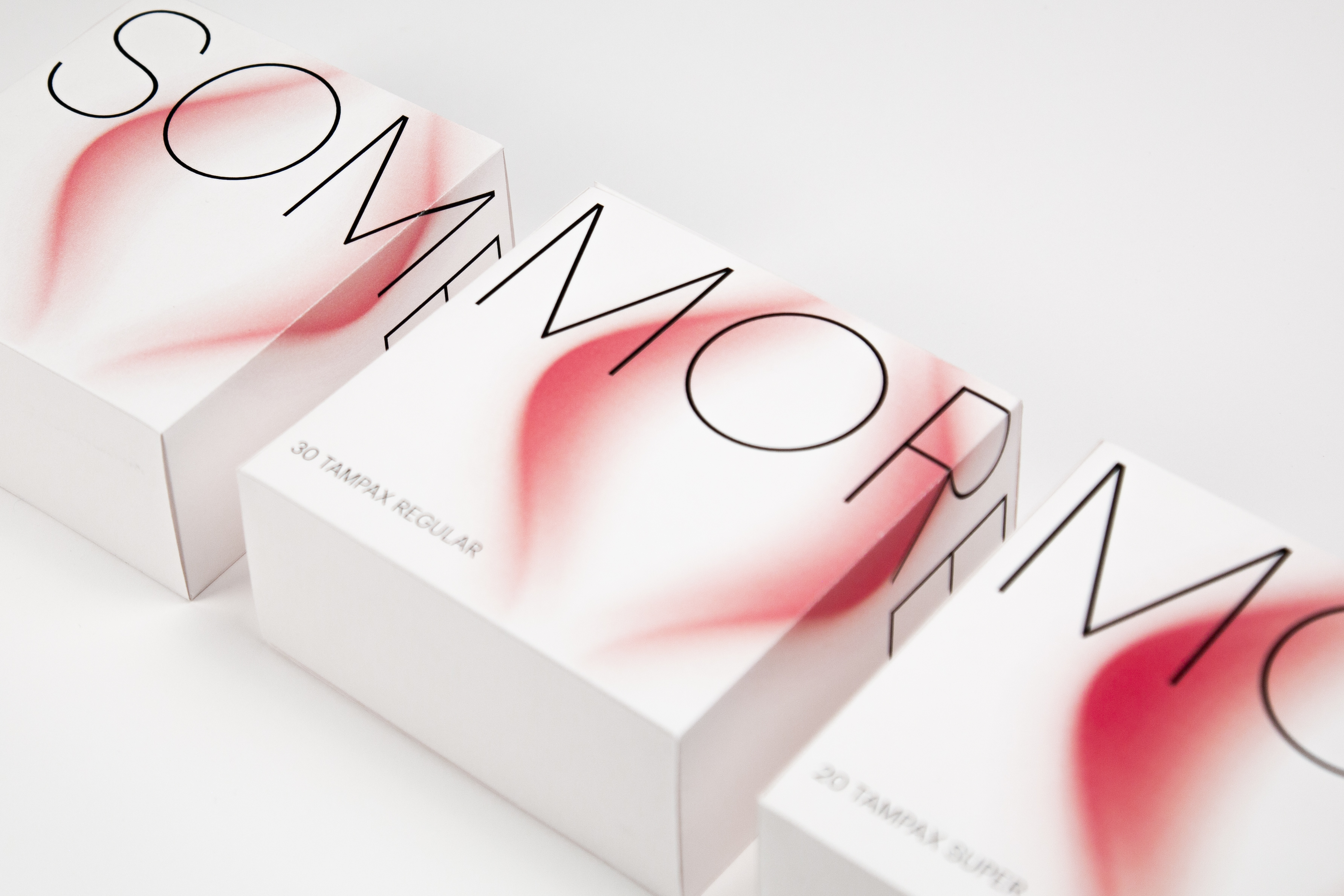
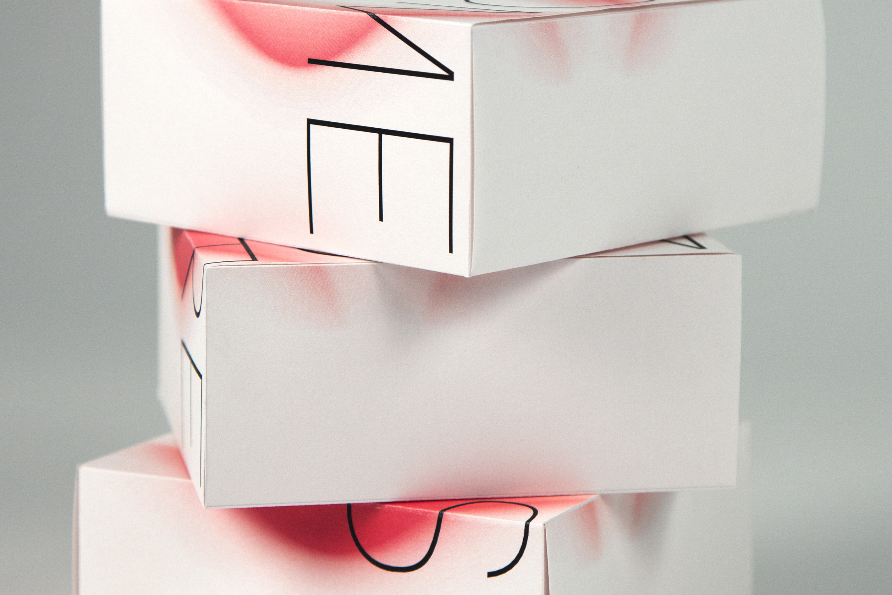
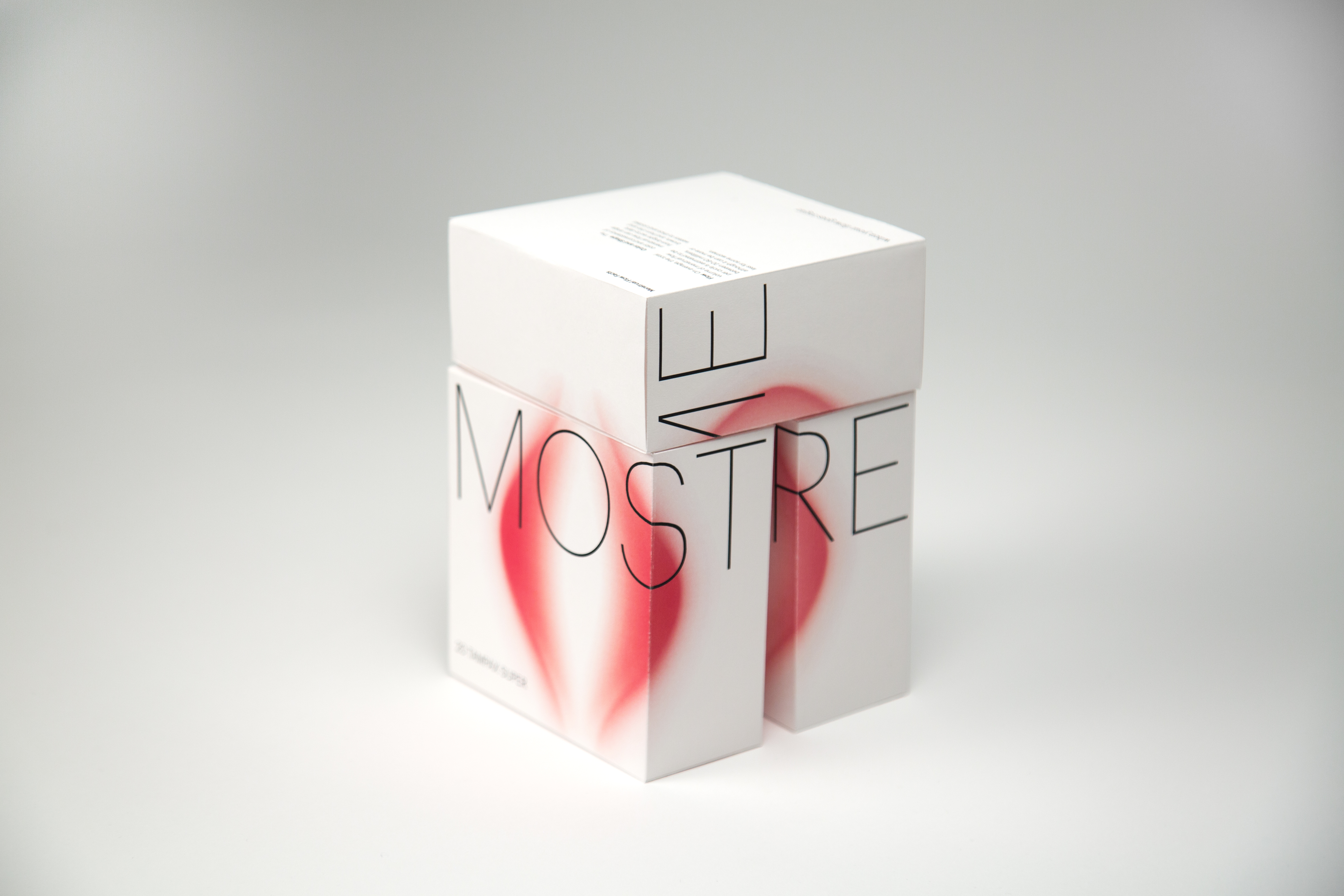
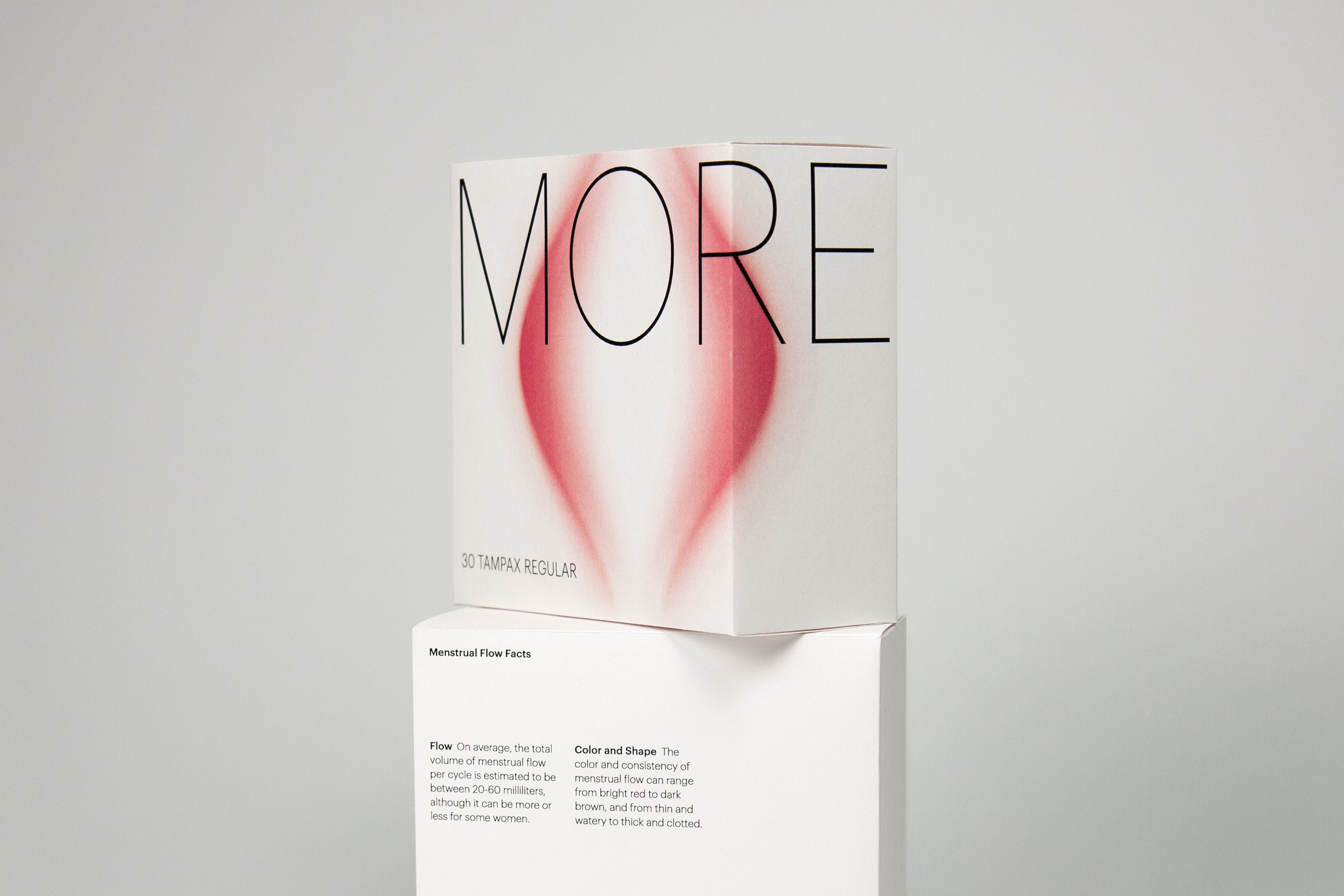
This rebranding project aims to reduce the shame of using feminine hygiene products through inclusive design that respects women’s unique experiences during menstruation. It features elegant lines that subtly suggest the female form and uses soft visuals to create a sense of calm and positivity. Subtle gradients and a clear "some," "more," and "most" system effectively communicate absorbency levels while maintaining a minimalist and sophisticated appearance.
Indigo Design Awards 2025, Silver
Indigo Design Awards 2025, Silver
GDUSA Package Design Awards 2025, Winner
Communication Arts Typography 2025, Shortlist
︎︎︎Featured in GDUSA April 2025
